Quality with a
smalltown smile
smalltown smile
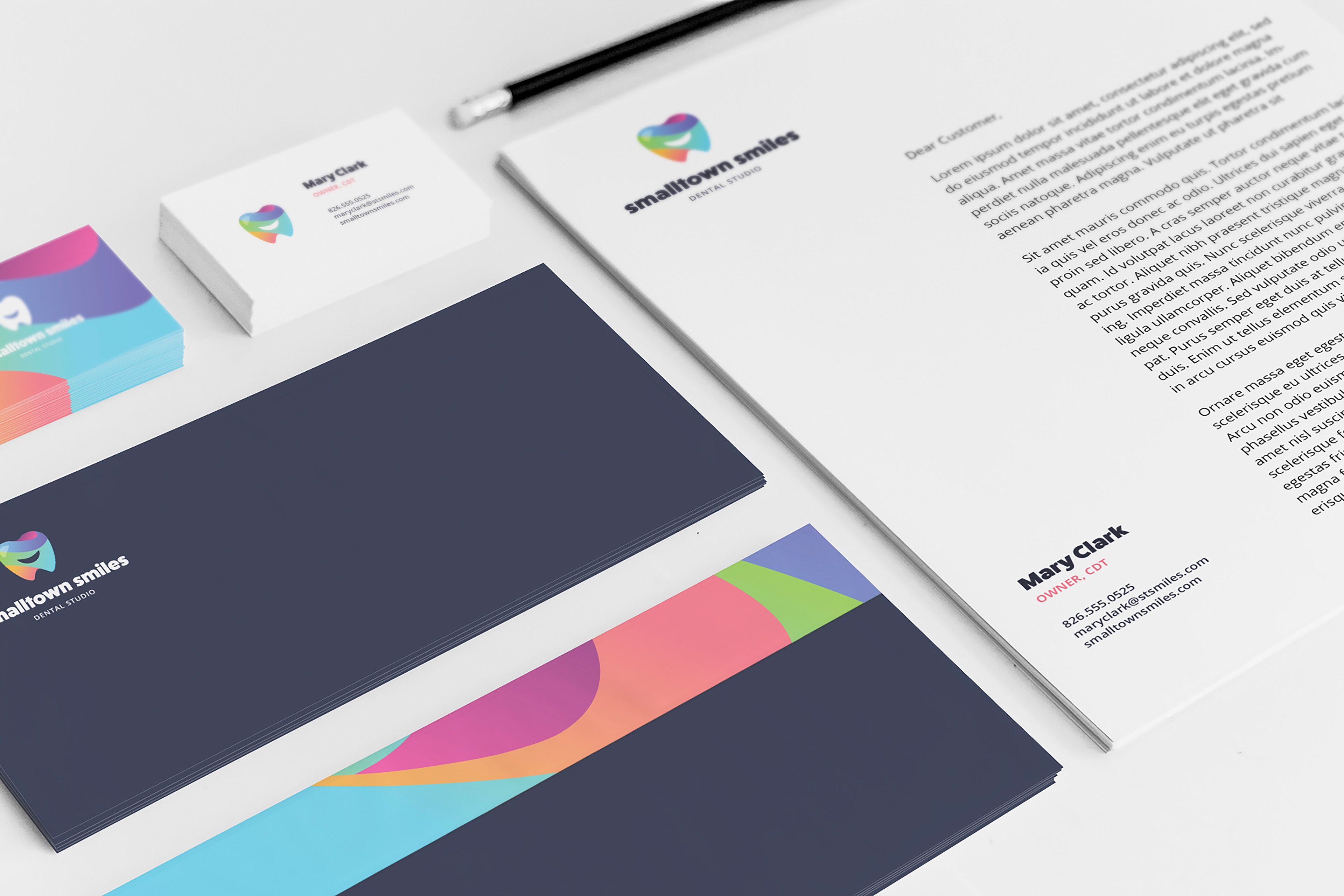
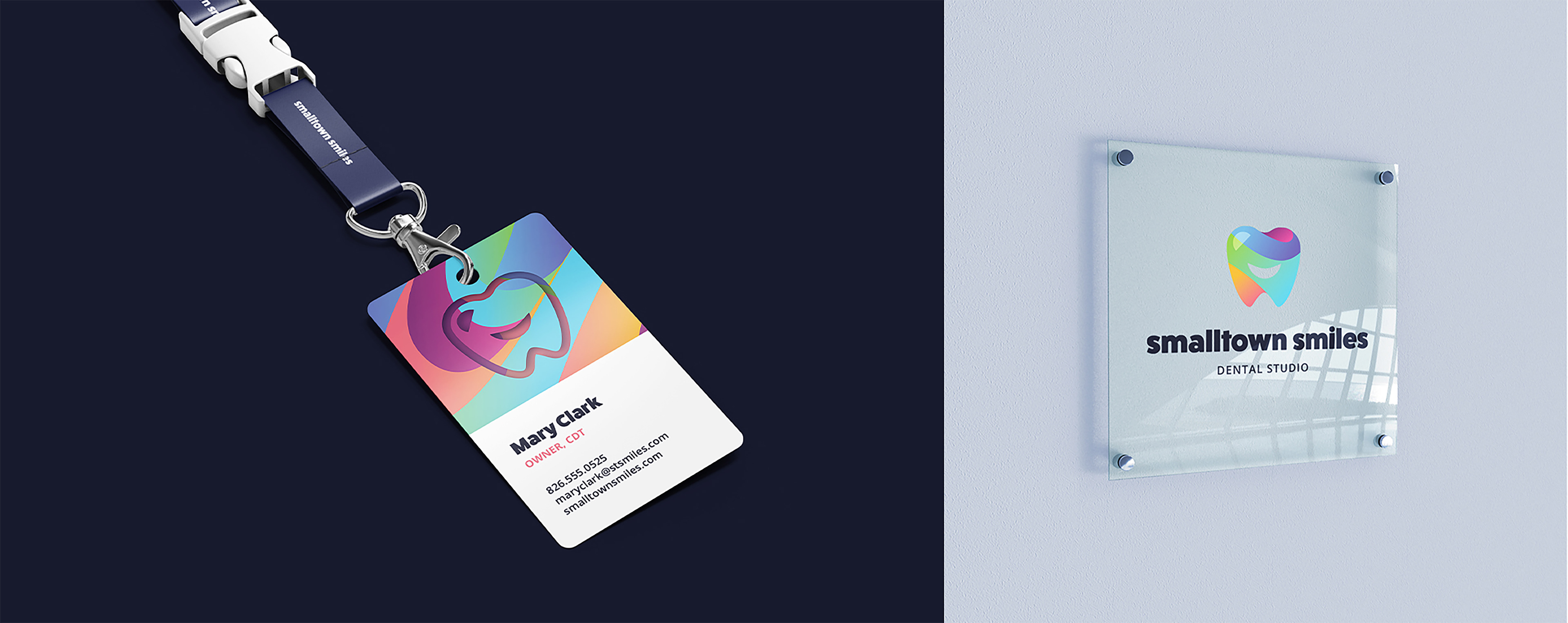
A local dental technician came to me with the need of branding and print collateral for their business.
As a rapidly growing business, they needed a professional eye catching brand to be implemented before the completion of their newly constructed studio.
Design exploration
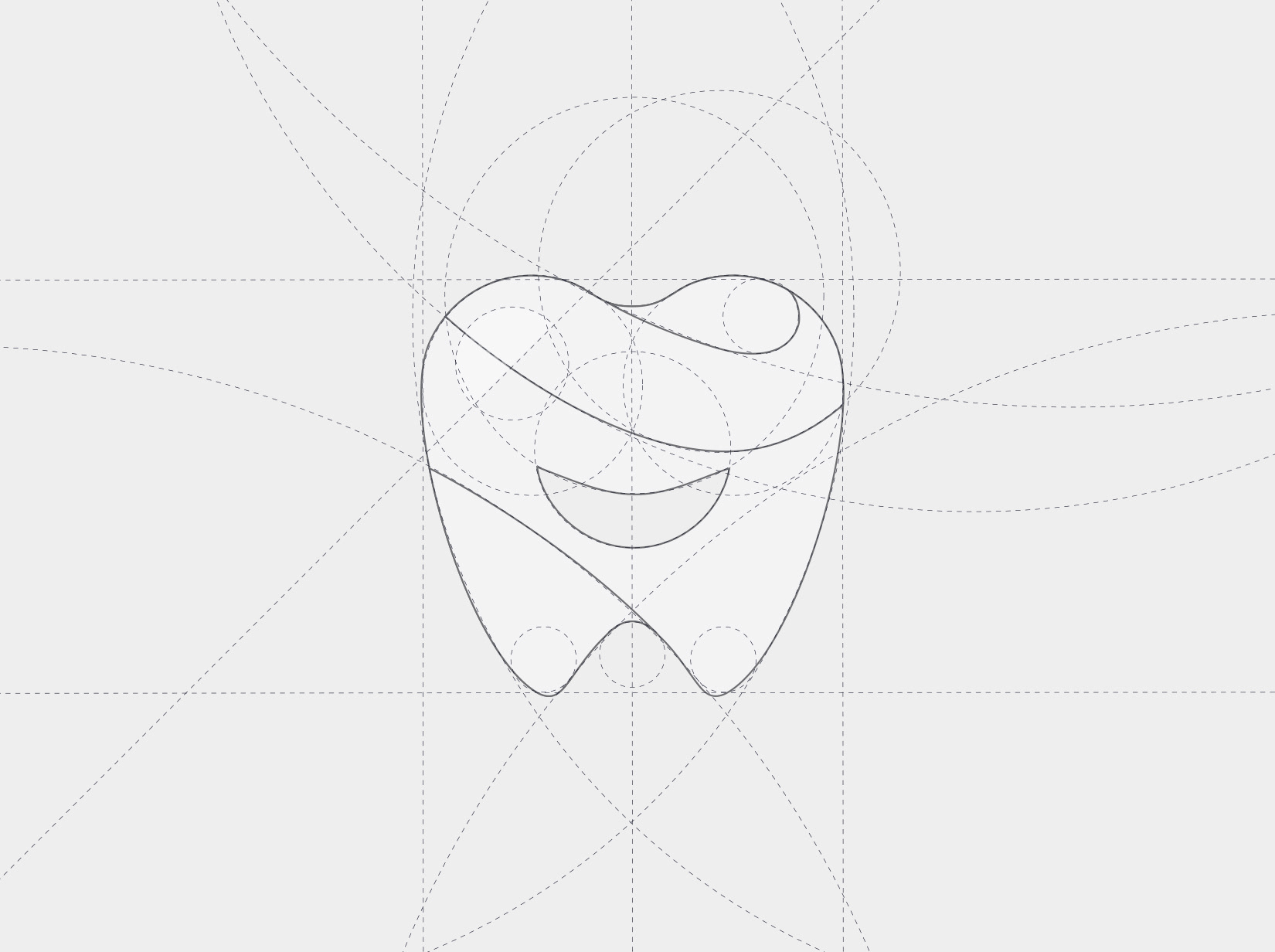
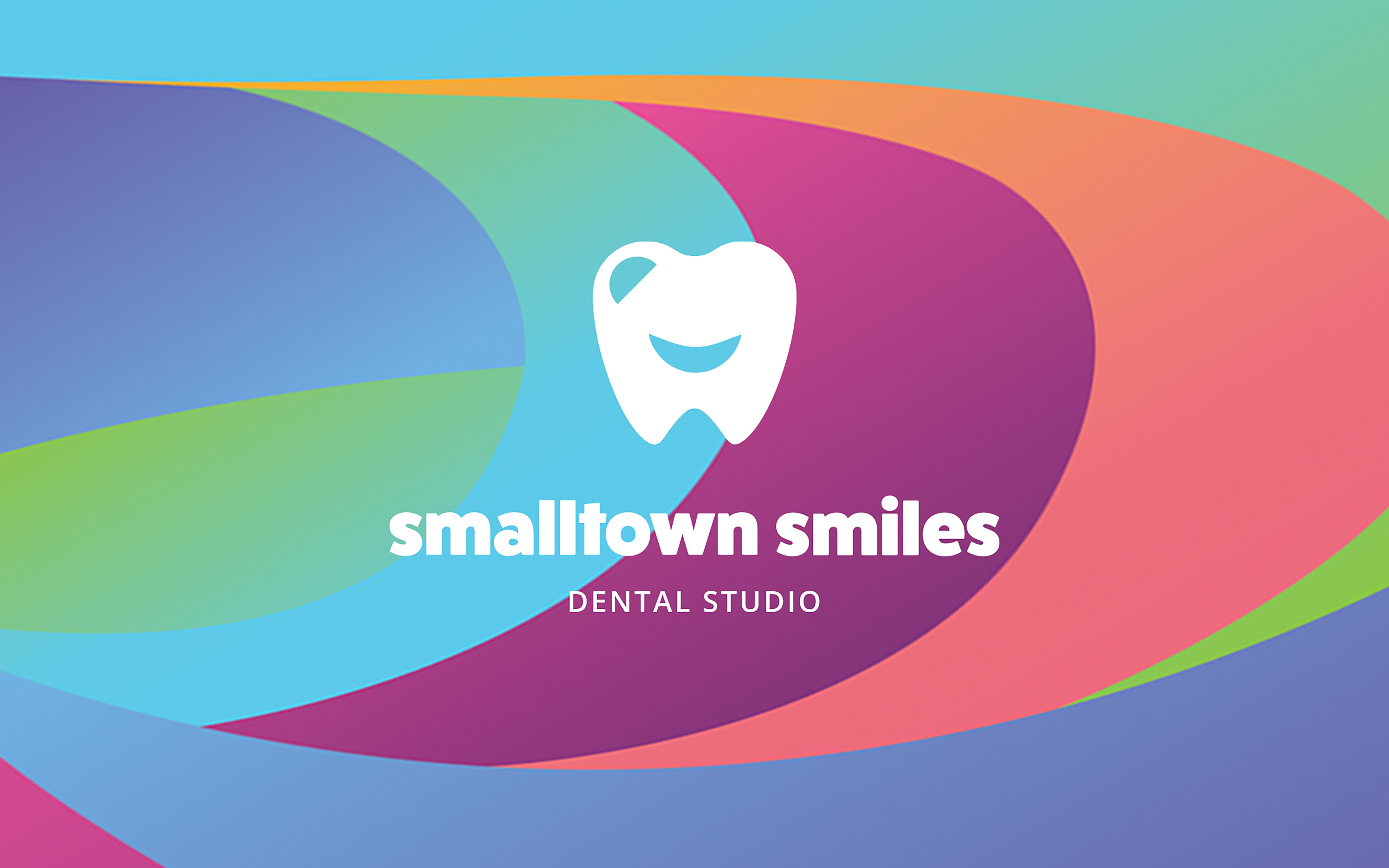
After filling out the creative brief, the client indicated they wanted a colorfully designed logo by referencing multiple images of rainbow teeth added to a mood board.
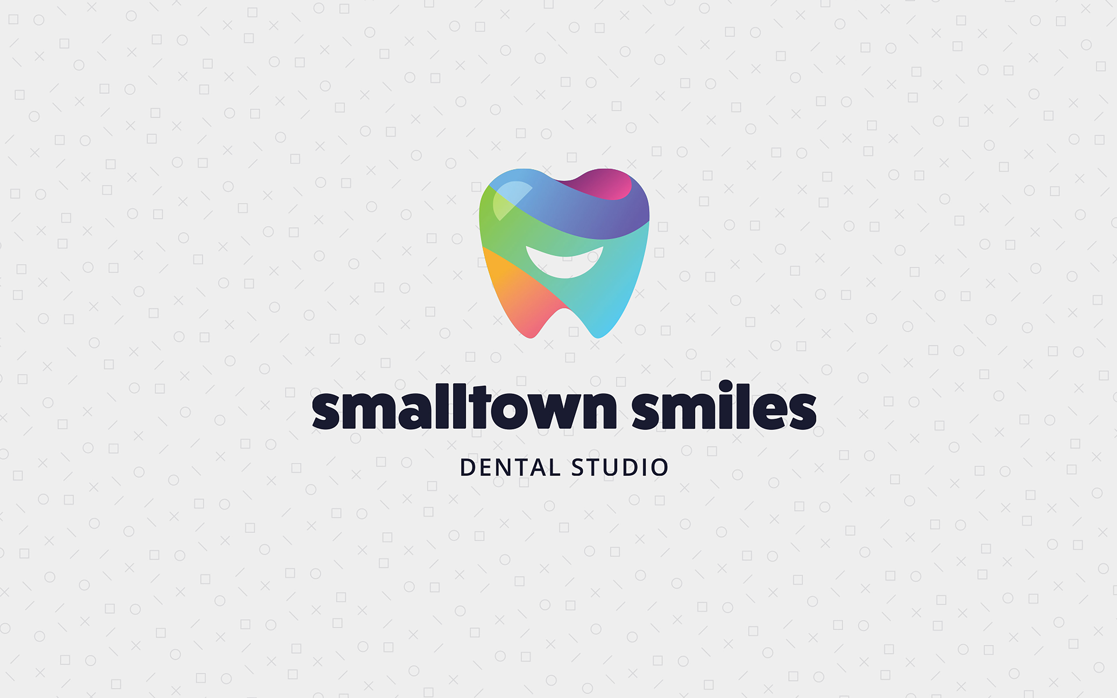
This was incorporated by dividing up the tooth icon into sections and using gradients to allow for more color use with minimal shapes.
Friendly &
big-boned type
big-boned type
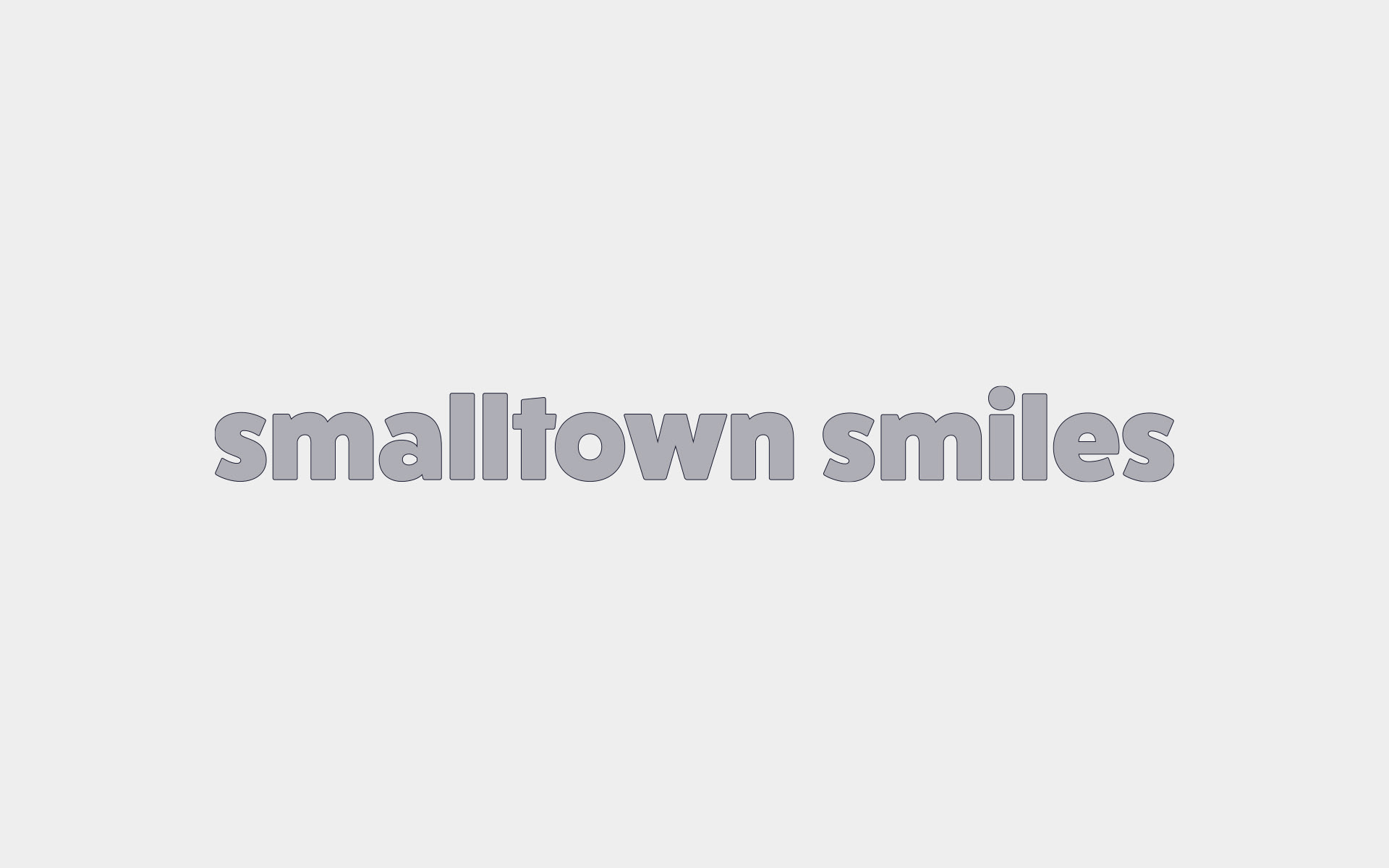
Type exploration for the wordmark needed to be heavy to keep balance with the tooth icon, but friendly to match the energy of the overall personality of the brand.

Fat Frank was the perfect choice for its heavy frame and rounded corners giving it a more inviting appearance.
Open Sans was chosen for "Dental Studio" in the logo and also is used for body copy on marketing materials.
Bright & colorful
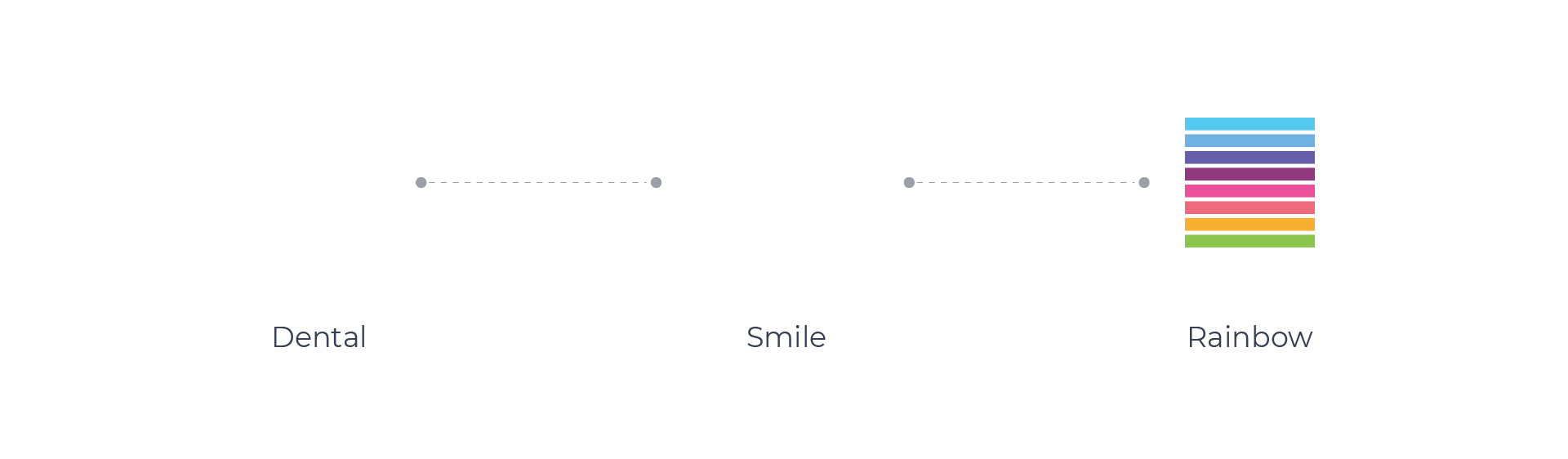
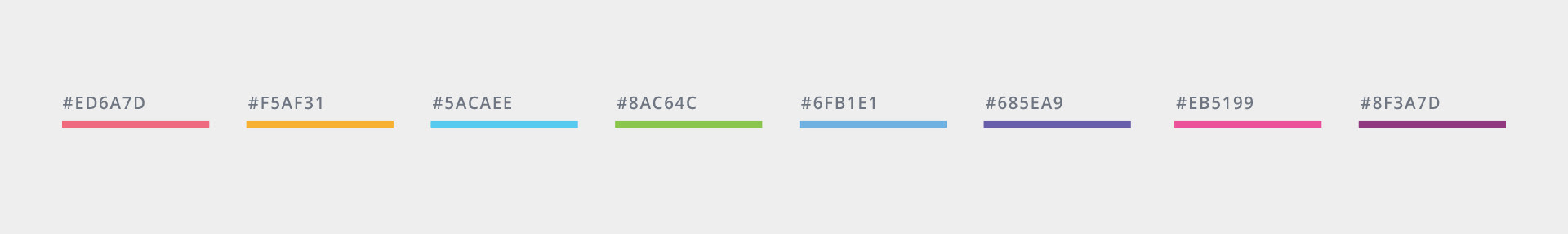
8 colors were chosen for an overall rainbow look, but carefully decided for complimenting each other when blended together as gradients.
The 8 colors combined into four shapes that make up the tooth icon, give a vibrant and friendly aesthetic.

Show off those pearly whites 😃


Got a smile on your face?