From printing company to modern marketer
One Point is a marketing distribution company has been in operation for over 50 years.
Starting out as a commercial printer, back then under the name Quality Printing, they later integrated marketing services and changed the name to reflect the growing list of those services.
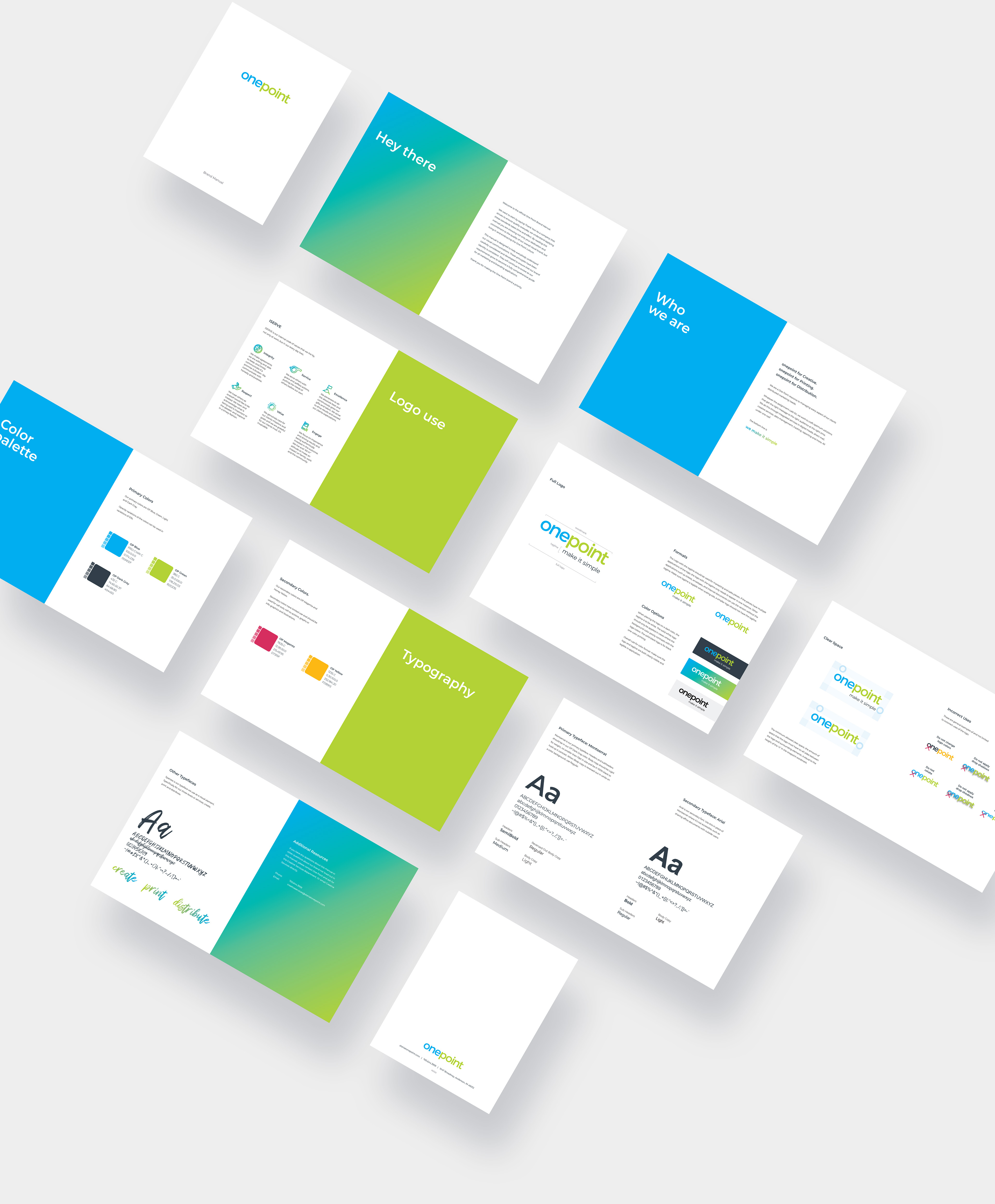
Three years after the name change, it was time for a brand refresh.
First, the logo
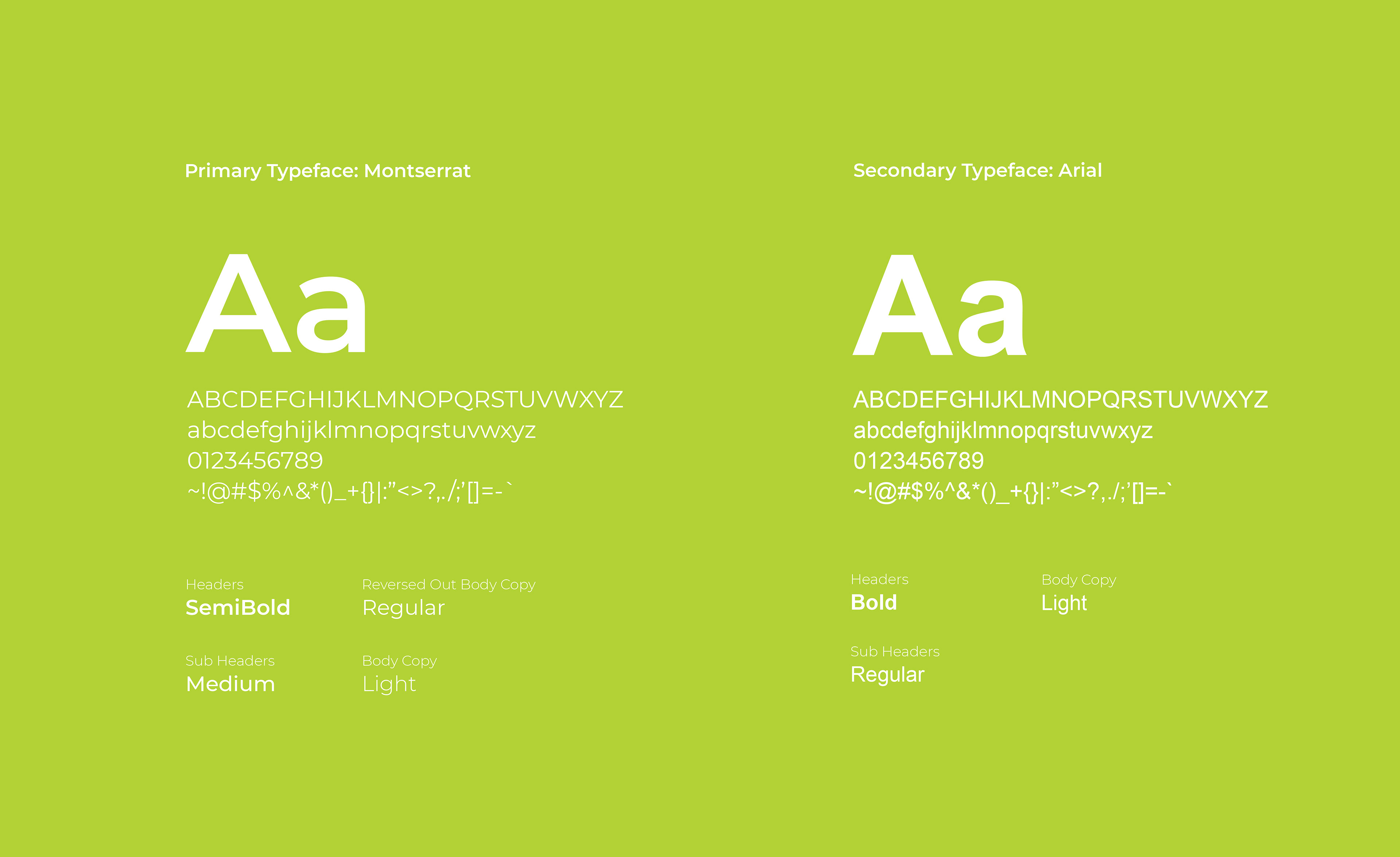
The project began by simplifying the logo. Removing the icon and switching cleaner heavier typeface.

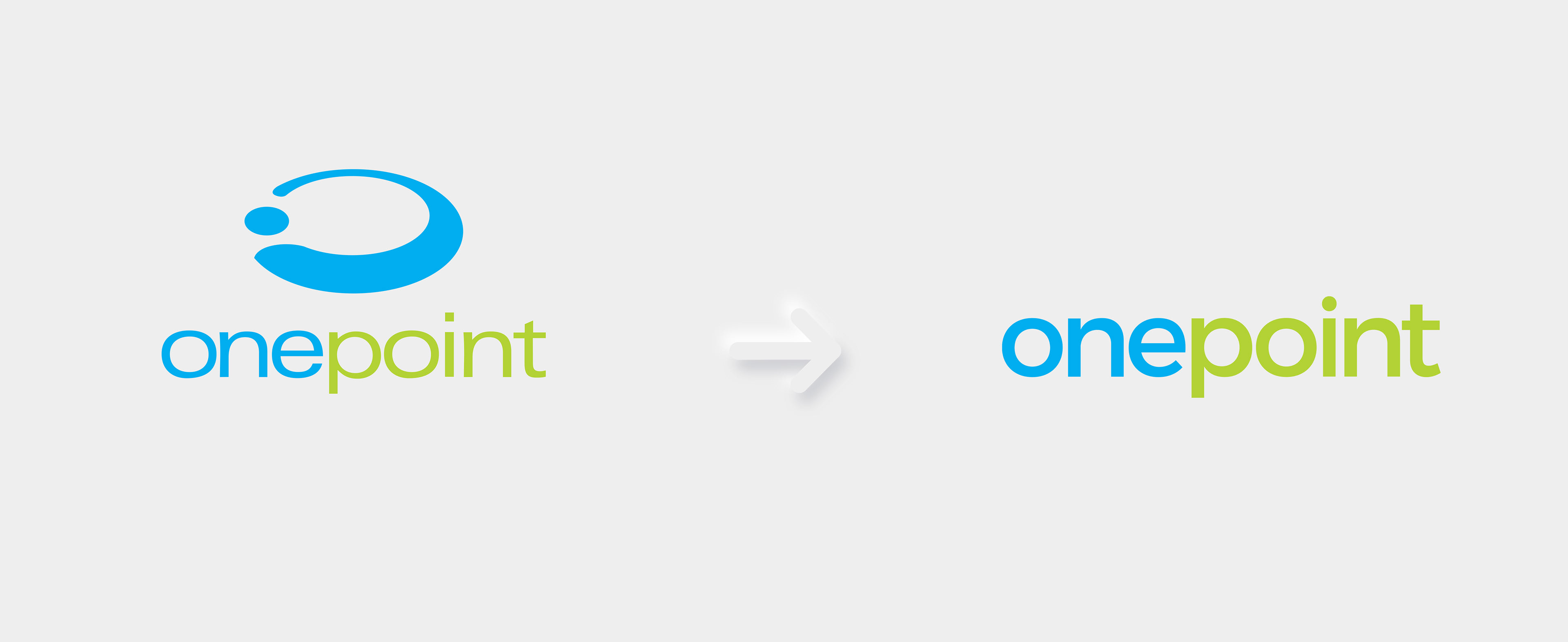
make it simple
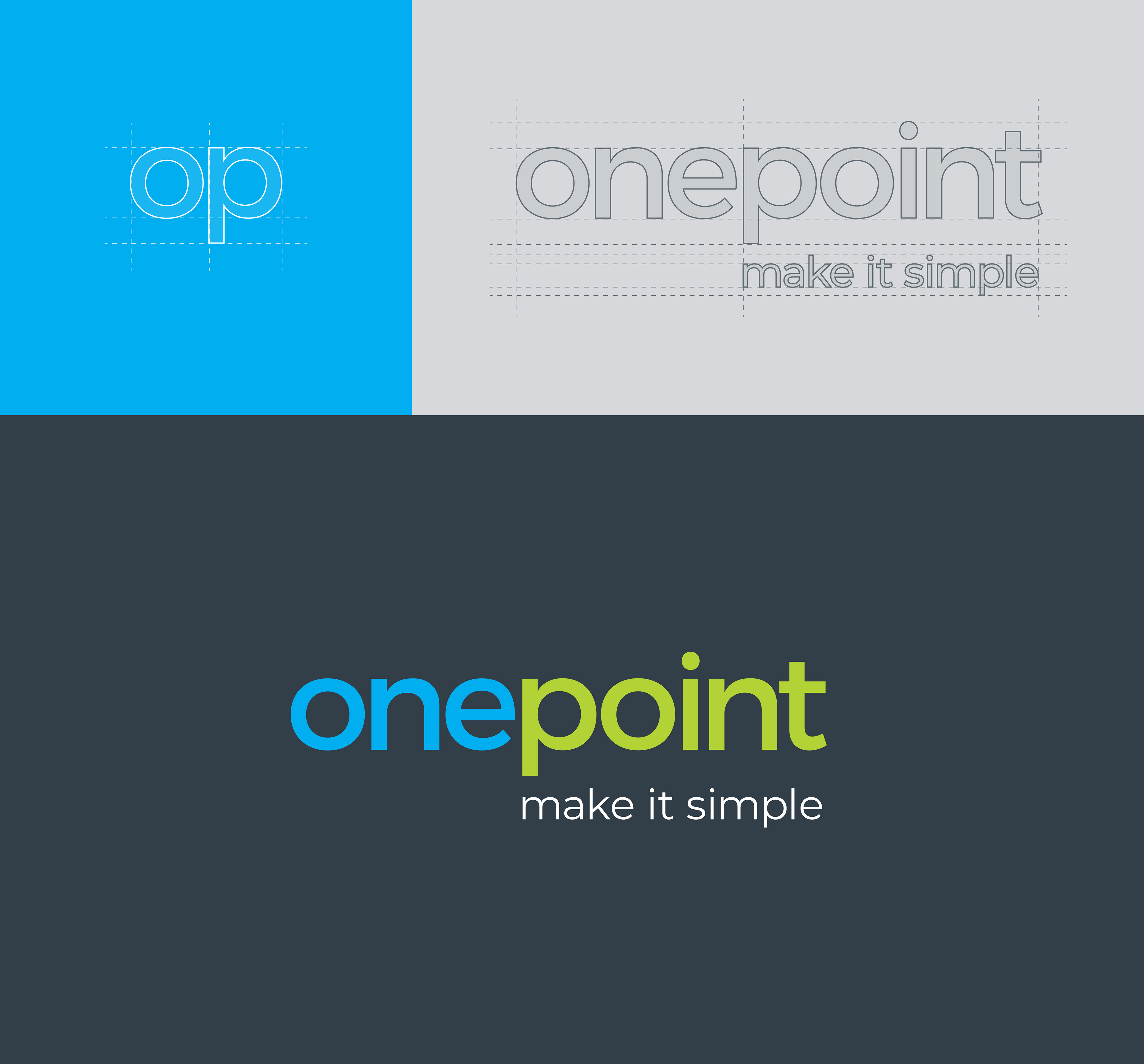
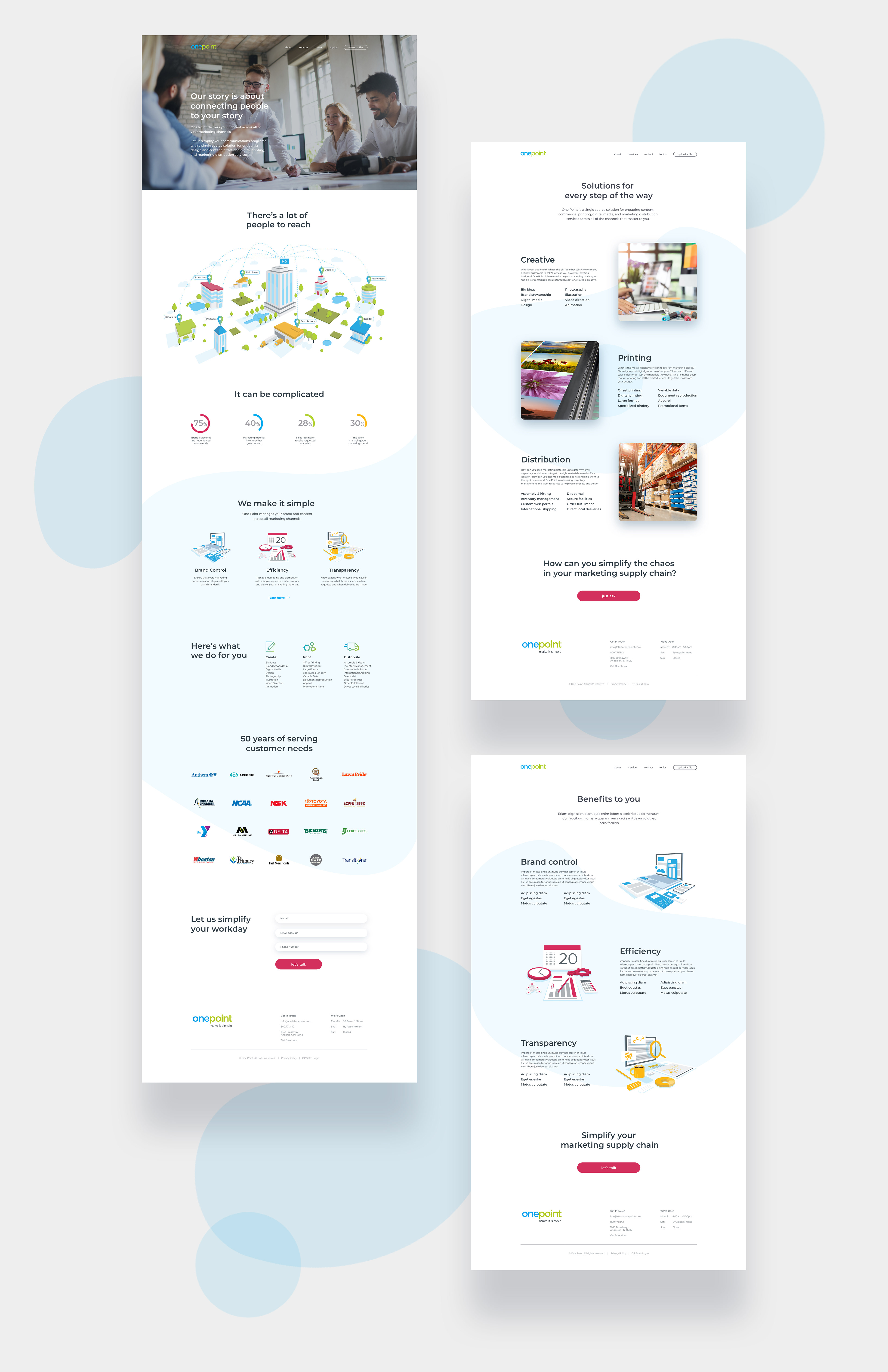
Illustration style
Illustrations were created to help tell the story. The style is a third dimensional landscape using brand colors for unity.


Iconography
Fonts & stuff

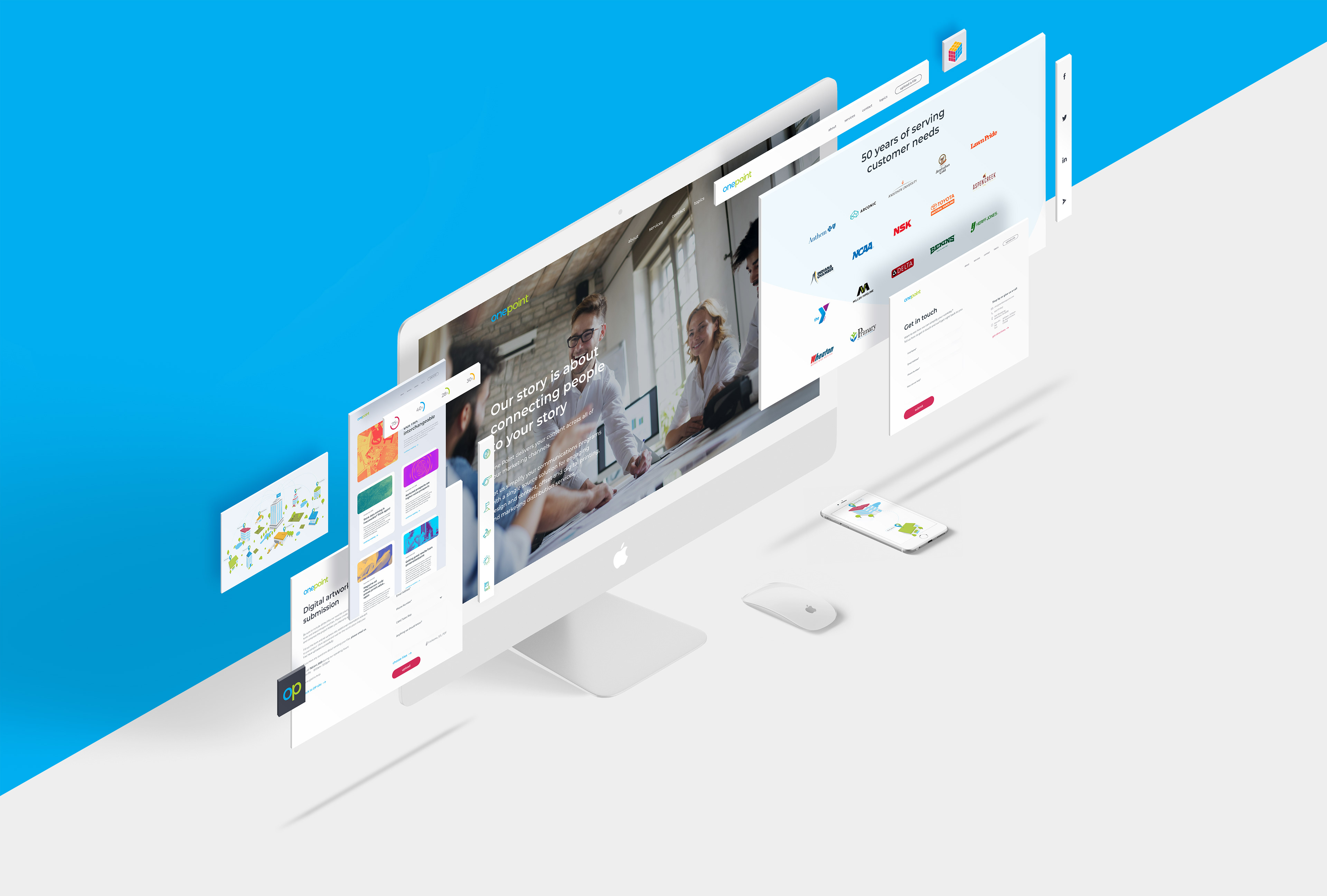
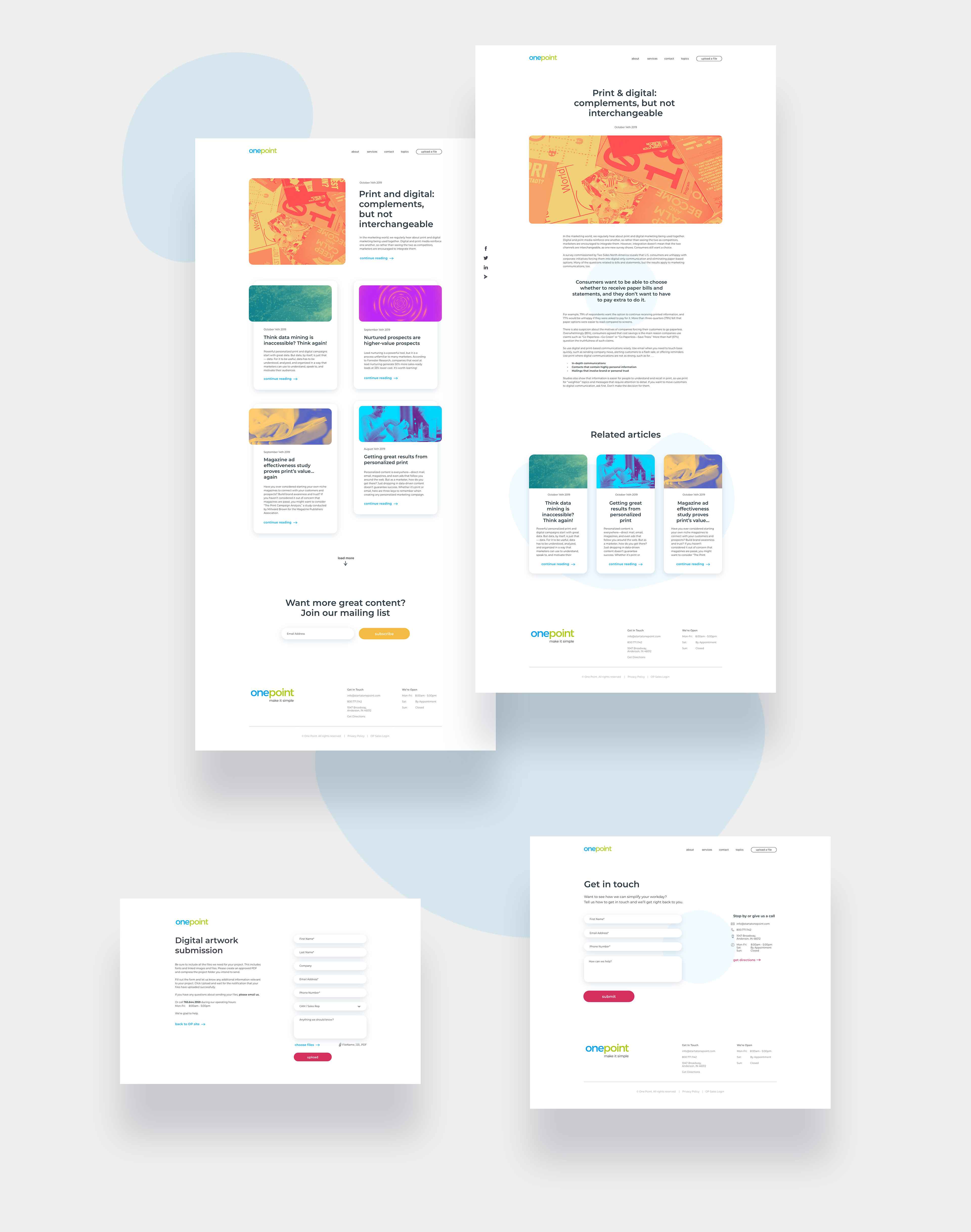
The website design was made to be clean and light, for a friendly looking interface. Reflecting the OP brand values.
The illustrations and two-toned photos makes colorful and interesting visuals to contrast with the white space.
And that's all she wrote
(well, for this project)
(well, for this project)