A taste of Indiana
QuinnsQ — a local BBQ business here in Indiana, requested help with branding of their start up.
After filling out a creative brief, the client requested for a "rock-and-roll" look and feel, as a nod to his second love, music.

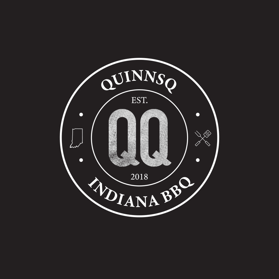
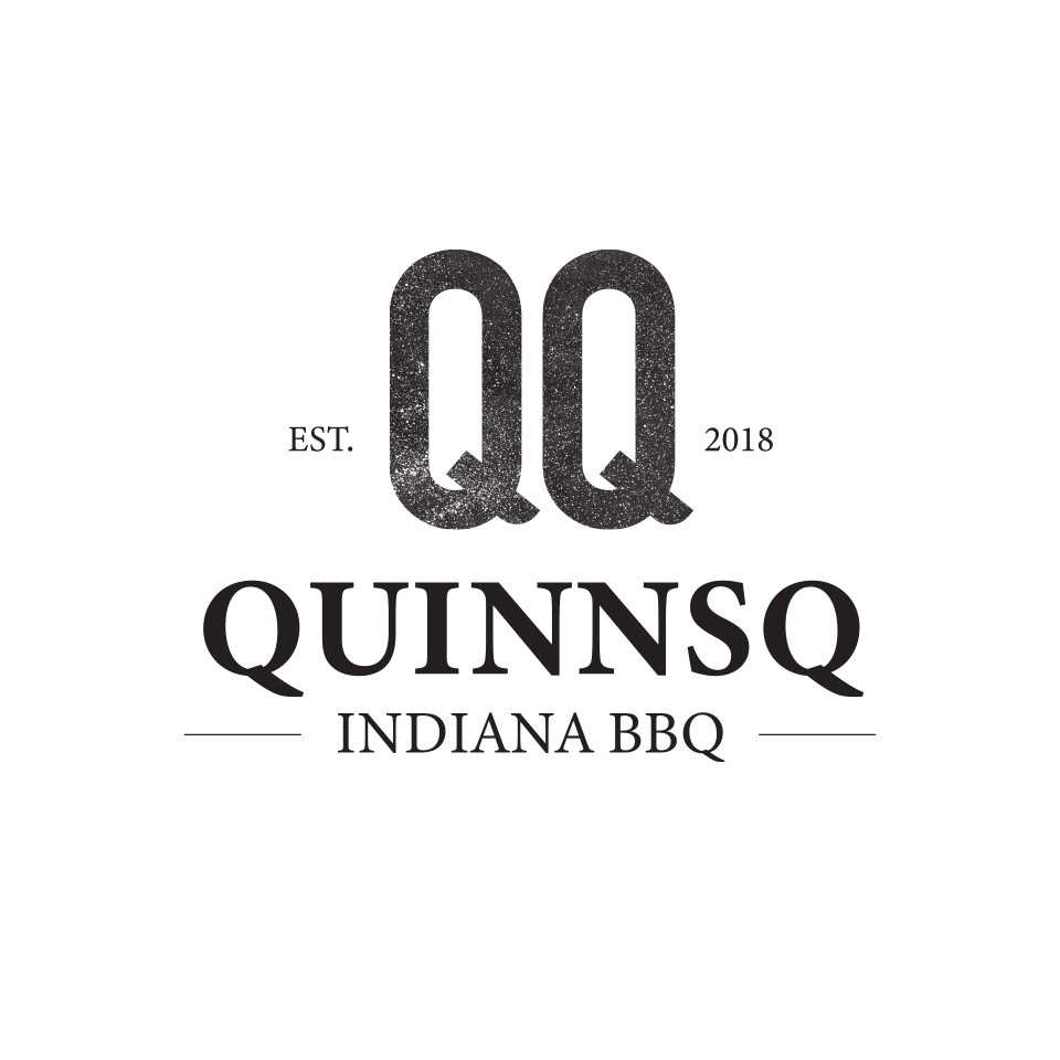
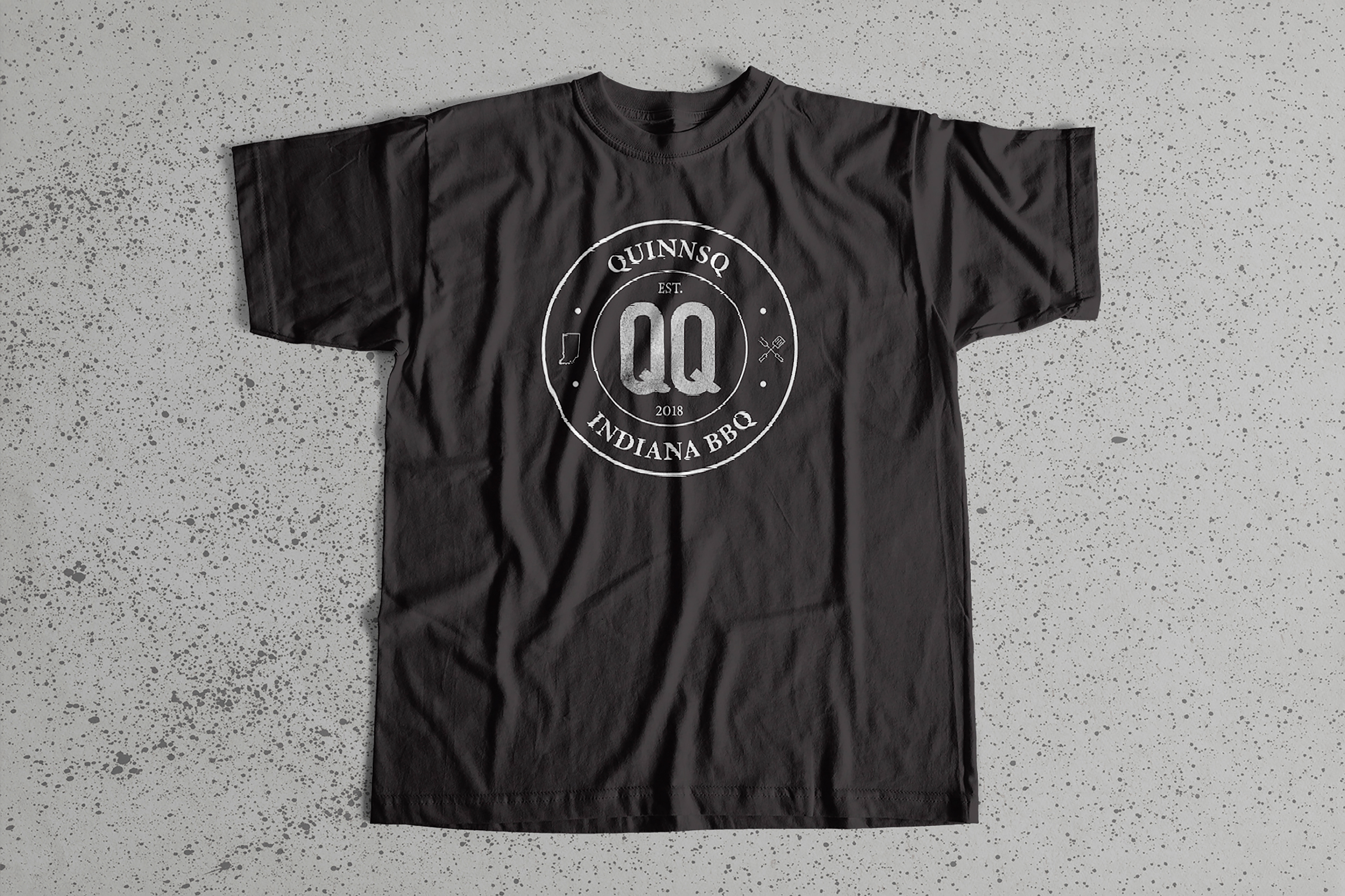
Double QQ
First step was sketching logo concepts.
Though the name is QuinnsQ, the client indicated the want for the initials to stand on their own, a double "QQ".
90's grunge influence 🤟
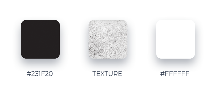
What's more rock-and-roll than black and distressed texture? For color exploration the thought was just that, a black and white logo, combined with a texture to push the grunge feel further.
A custom sans serif font for the double Q's paired with a secondary serif font for the name, added symbols and grommets top it off for an overall 90's rock vibe.
Color & texture
Typeface

Symbols

It's all in the details


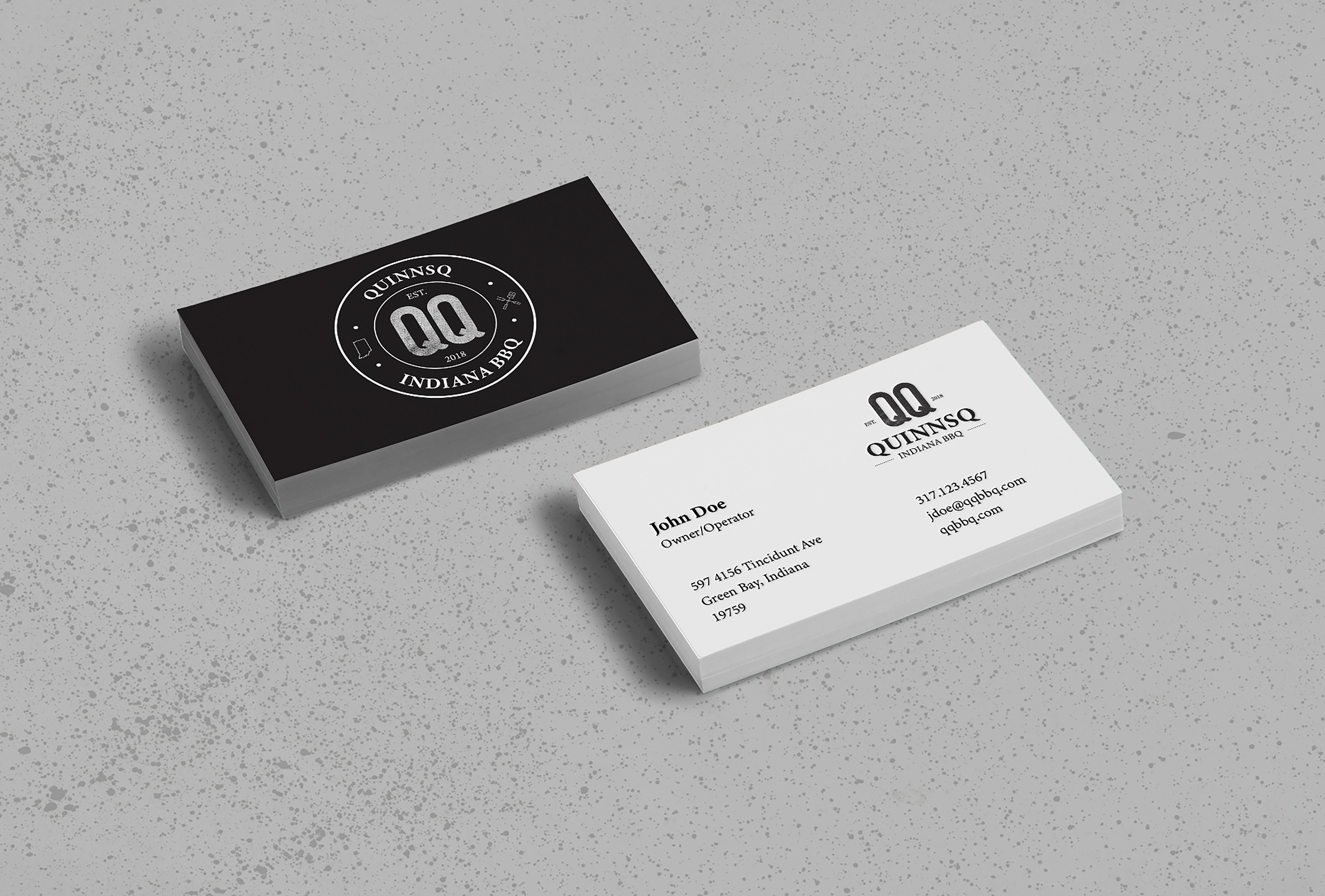
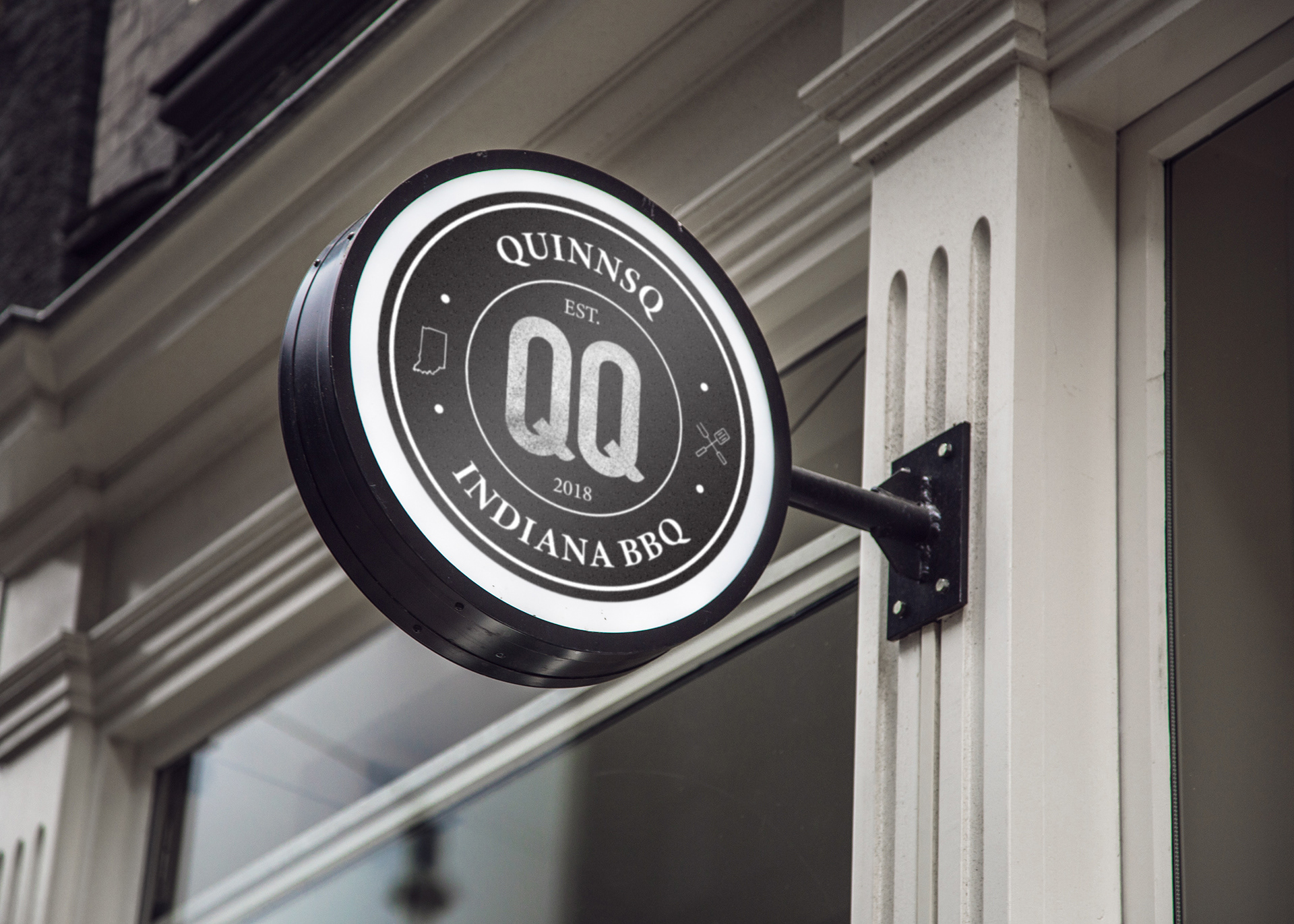
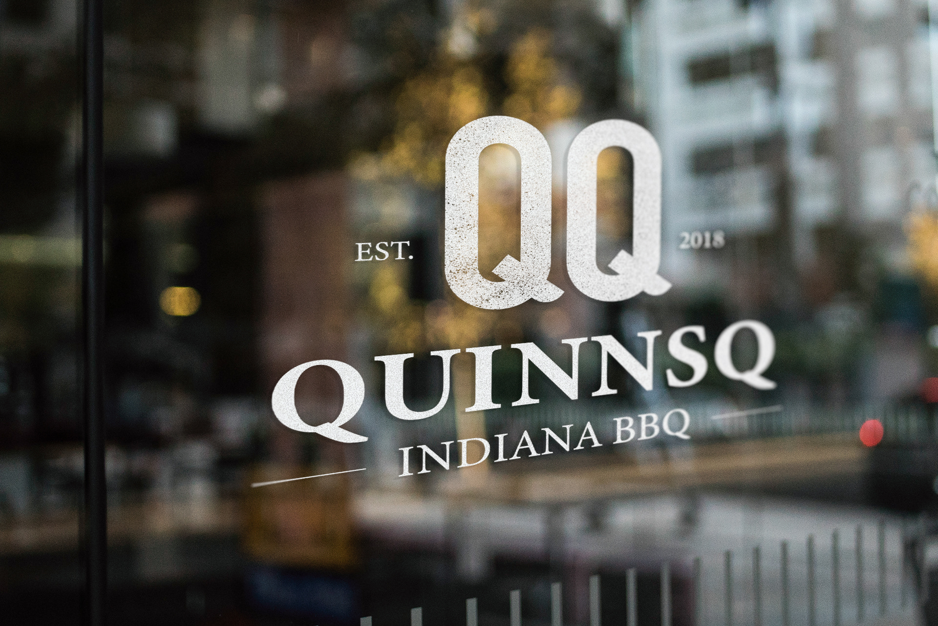
"Can I use both?"
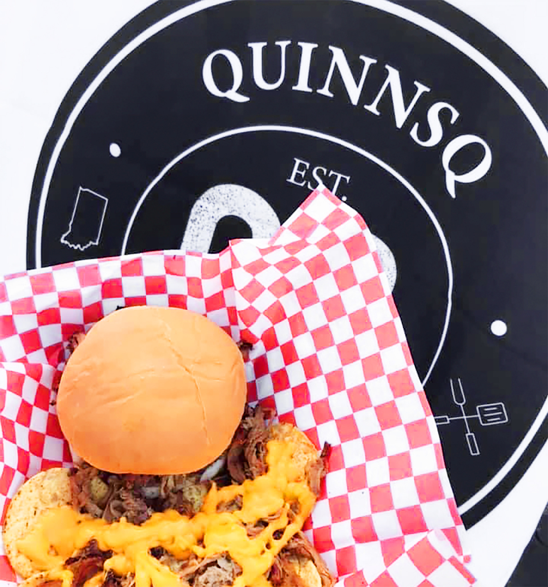
Two versions it is then. The client ended up not being able to decide between two variations of the logo. They are both incorporated with specific applications for each.


Hungry for more?